Case study
Healthwatch Hillingdon: Seen and Heard
Healthwatch Hillingdon is a health and social care watchdog. Seen & Heard: Why Not Now? is their second brochure in a series focusing on young People’s healthcare and wellbeing, and in particular on mental health issues. Medievalbookshop was commissioned to design and produce the brochure, with the brief stating that some attention be given to the previous publication, but that its design should not be a slavish copy. Hillingdon is part of a national Healthwatch campaign, so the national style guidelines had to be adhered to, with particular regard to the colour palette, and it was specified that frequent use should be made of of the Healthwatch marque (the 'quote mark' graphic which appears throughout their publications).
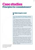
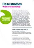
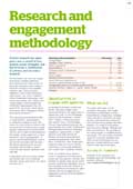
The brochure was initially produced as an online document, and it was later decided to produce a printed version as well. Scroll down this page to look at some sample pages, and click on the thumbnails to view larger versions with commentary.
You can look at the full brochure here, and the Healthwatch Hillingdon website here.
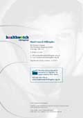
Cover design
There was little budget spare for illustration in this project, so it was decided to make maximum use of what was available by buying a strong photographic image for the front cover.
Sample page designs
Here’s a selection of pages from the brochure…


